7. February 2016
The DAX as a bank robber
Two tools that describe the current DAX situation
Let’s do an update on the DAX and the general level of the stock market. In my last blog from 16. January I described the situation from the point of view of the technical analysis. And we got a pretty clear conclusion from this. But today we want to take it a step further and use two other tools that can shed a light on the situation, but coming from a different angle than the technical analysis.
Conclusion 1
Let’s do a quick review of the conclusion from 16. January: The DAX has increased perfectly according to the maximum target, and right now the upside potential is very limited. Furthermore the whole structure of the DAX is still “sideways”. So we have a sideways structure (first down, and then up, but not going to new heights). And the technical analysis was “waiting for the next trend”, but showing that most of the evidence points to a coming downtrend - starting at some point in 2017.
Two new tools:
We don’t want to hang around and simply wait for the next trend. We want to know. And this means that we can employ other tools than the technical analysis. There are many, but today I will show two more:
1. Macro Economy
2. Deviation from trend
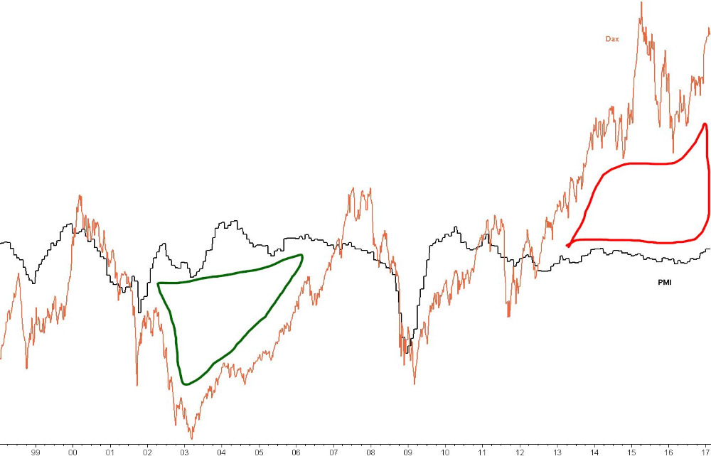
Graph 1 Macro economy
I will start with a very simple comparison between DAX and the economy. I use more advanced models also, and I’ll show them in a later blog. But I always like to start out simple. In fact, so simple that it is almost too simple. The orange DAX is compared to the black PMI (Purchasing Managers Index). The PMI is a proxy for the GDP, and it shows the strength of the economy.
(World PMI has nothing to do with “expectations” but is a clear measurement that has a tight correlation with world GDP. Furthermore it has the advantage of being updated every month, and is not missing the last 3-5 month data as the GDP does. So the PMI is really useful as an up-to-date proxy for the GDP).
The conclusion of graph 1: There is a “general” correlation between the macro economy and the DAX. The PMI seems sometimes to be a leading indicator to the DAX, although it is not consistent enough to be used actively. I have marked a green ring and a red ring. In these two cases the macro economy and the DAX got too far away from each other. We can call them an anti-bubble and a bubble.
The green bubble shows that the stock market went way too deep in 2002-2005, compared to a reasonably sound economy. That was a perfect setup for a strong advance in the DAX in order to “catch up” with the economy. The stock market was simply too pessimistic in 2002-2005.
The red bubble in 2013-2016 shows the opposite situation where the stock market is way too optimistic compared to the reasonably muted macro economy. This suggest a “bubble”, and this can be a perfect setup for a strong decline in the DAX in order to “catch up” with the economy. If not, then the economy has some strong catching up to do. But basically this lends credibility to the idea that the stock market is in a bubble, giving us a warning.
A word of caution: The conclusion seems very straight forward. It is a bit too simple to just compare the two things in a chart (and we have more sophisticated methods) but this simple approach often has a basic kernel of truth in it.
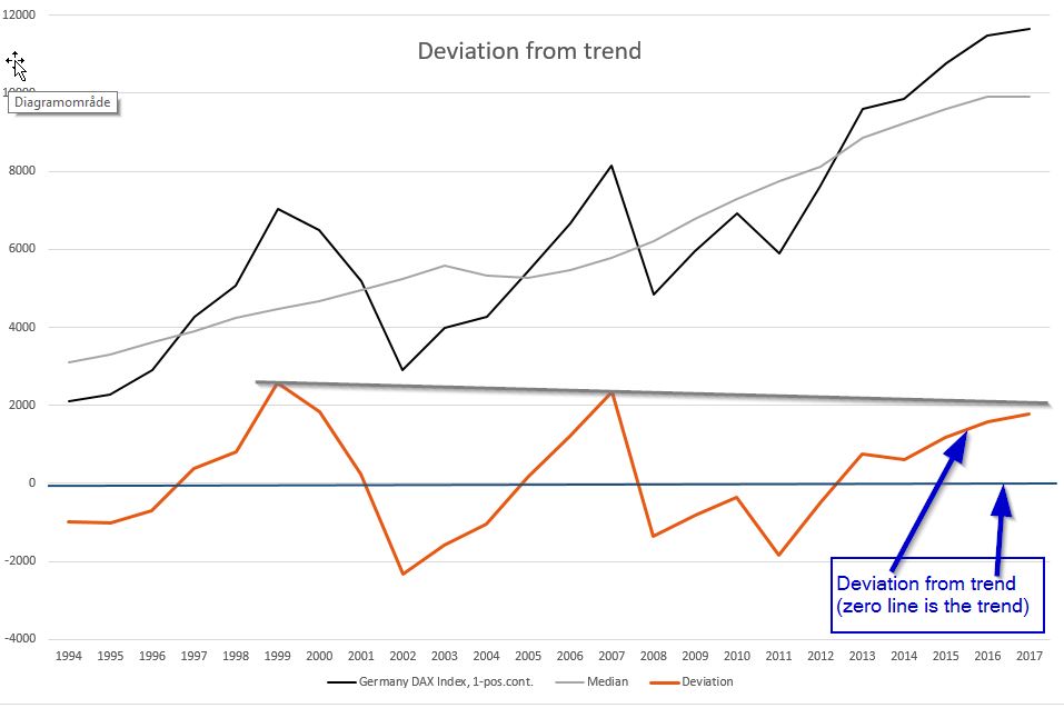
Graph 2 Deviation from trend
This is a really useful and simple tool that all the old masters have used, especially one of my favourite researchers, Edward Dewey. On the chart we have the yearly DAX (not monthly, but yearly). The grey line is a 9 year centered mean. We now subtract the two lines and we get “devations from the trend”. This is shown as an orange line in the lower half of the chart.
When looking at the orange line we can now see the “size” of stock bubbles and anti-bubbles. And it is clear to see that we are approaching a level in 2017 that is roughly the same size as the last two bubbles. That is a clear warning that we could be in the last phase of the uptrend.
A word of caution: Point 1: Two bubbles and two anti-bubbles are a good indication, but we need more to make a strong conclusion. Fortunately we have data more than a hundred years back, also on the S&P, and the conclusion remains the same: All stock markets are getting as far away from the main trend as we normally see. Point 2: The latter part of the centered mean can be calculated using a Hodrick–Prescott filter, or simply estimated using your experience.
Bubble burst
My aim was that you should get a strong feeling for what we are trying to do here: Evidence stacking. We simply don’t rely on just one set of tools to be the ultimate judge. Instead we use them all and stack them to give evidence. We don’t believe in one guy that claimed he saw the bank robber, but we believe it when the bank robber is described by the clerk, the security guard, a passer-by and the lady that got knocked over when he fled the bank with the money.
Does the bank robber look like the DAX?
Technical analysis: Sideways trend, with a high probability of a coming downtrend. But no sell signal yet.
PMI versus DAX: The stock market is in a bubble compared to the macro economy, showing a high probability of a decline.
Deviation from trend: The market is close to getting as far away from the trend as the last two bubbles, indicating a coming downtrend as highly probable.
The strong point is that all the models point to the same conclusion. And still I don’t sell my stocks until I get a valid break below the moving average. But I now have a much better feeling for what the state of the stock market is. We see a balloon that has been blown out of proportions, and a balloon can always hold “just a bit more air”….until it pops. But the size of the balloon is getting to the size where we start to get a twich around the eyes. Hey, are you already putting your fingers in your ears?