15. December 2018
"What is your track record" - part 2
Sorry about the long wait. Life has a way of taking you places, and I have been busy with several things…but here is the second part of “Track record”.
I said that I would show you a practical example of my own track record. I learn much more from practical examples than mere theory, so I will show you my track record for Brent oil.
I really don’t want to pick an example where “everything was hit 100%”. That would just be distasteful. And there is also no point in showing an example where I got it totally wrong. So in this Brent oil example you get a mixture. I will show you the good, the bad and the ugly.
The good
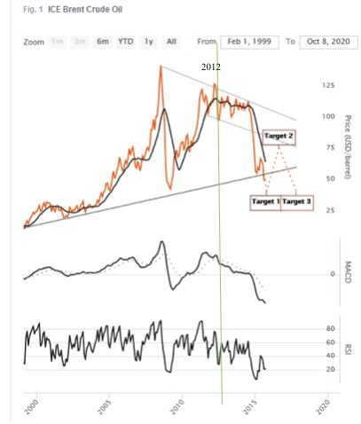
If my only concern was to “look good” and be impressive, then I would show this long term forecast for Brent oil - see the graph no 1. This forecast was made in 2014, showing a Target 1 low point to come “late 2015, early 2016 at roughly 40 USD”, and then Target 2 shows an increase to a “Q3 2018 peak at 60-80 USD”.
How would you rate the accuracy of this? The low point came January 2016 at 38 USD, and the peak came in October 2018 at 84 USD. Yes, the peak came 3 days into Q4 and not in Q3, but 3 days is acceptable, right :-) And yes the peak came 4 USD higher than 80 USD, but all in all this is rather accurate - seeing as this is a forecast made in early 2014. Graph no 2 shows the real price movement. All in all practically a “bulls- eye”. Now let’s look at the bad...
The bad
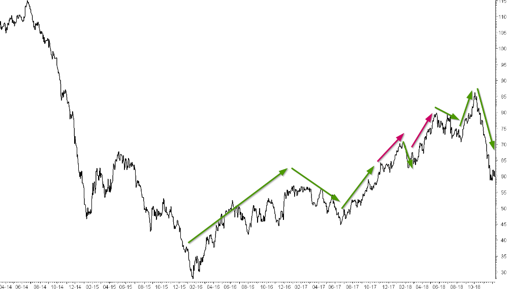
Will our forecast for Brent oil continue to be impressive if we look at the medium term forecast? Oh yes - it is not enough to forecast long term price movements for brent. You also need to forecast the medium term movements of 3-6 months trends. So we can now see the track record for that.
Graph 2 shows green arrows (where the forecast was right and on track), and red trend arrows (where it was not on track). You can see that there was a good number of green arrows, but I didn’t quite get all the movements right. The red arrows shows extraordinary straight increase where I thought we could see some zigzag movement instead. I knew that prices would eventually go up, but I just didn’t expect such an unrelenting increase without some zigzags. So the red arrows will diminish my track record.
The Ugly
Now to the ugly part. Yes, exactly - the part that no-one normally shows you. A forecast is fine, but I’m a practical guy. It also needs to be followed up with practical action - i.e hedging oil price (or buying the stock you forecasted). Without action there is no benefit. My recommendations are normally stated as “Initiate” where you definitely have to do something, and “Consider” where I think there’s a good chance, but it is really up to your own judgement and risk tolerance. And when I look back at brent oil I had way too many “Consider” and too few “Initiate”. I simply were not bold enough. So the forecast was really good, but the practical hedging was so-so. True, I did say “consider” and that meant that you could have done something. But in the end I was not impressed with myself.
The important question here is: Should we make a track record of his “Forecast accuracy” or his “Hedging accuracy”? Can you see how I just pile more and more things on top of each other, and every piece is making “track records” more and more difficult. It started out as a quite simple exercise - mathematically clean and easy - and has ended with a chaotic tumble. That is why I don’t like track records.
The downright ugly
Now that we had a look a my track record for brent oil (mostly proud of it, but realizing that it is not perfect) we can take an example of a really ugly one. I don’t want to tell you who the forecasters are and what item they are forecasting. Let’s just say it is really high profile names and everything is public knowledge, and I have the facts for verification. I sometimes use examples like this when I’m doing workshops. I have gathered a great number of such examples.
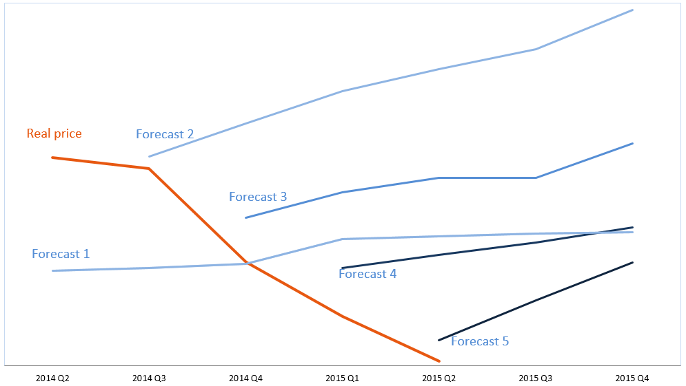
Graph 3 shows the example of a real life forecast. There is a very interesting story to accompany this chart, but here I just show the bare facts: The quarterly forecast and where the real price went.
The forecasters here claimed that they were 95-99% accurate. Impressive, isn’t it? But if you look at the graph you may wonder how they come to 99% accuracy. Well, every quarter they only measure “this quarter”. They measure "How far did prices move away from the forecast this quarter”. They don’t measure this year or next year, or whether the direction was right or wrong. Only distance in this quarter. How about that? Is that a fair way to measure?
The really ugly part in graph 3 is that prices didn’t increase as they forecasted. Prices fell instead. How about that? So for 2 years in a row they made all the wrong forecasts, predicting uptrend after uptrend, but prices fell instead. And yet they were “95-99% accurate”.
Money
You are actually a bit wrong when you think this Graph 3 forecast is 0% accurate. I look at things in terms of money. You see, I know someone who followed the advice of the graph 3 forecast and lost money every time. Let us say I gave these 5 wrong forecasts and people lost money on each forecast. If I now have 5 bad forecasts (losing money) and the next forecast is good (earning money). Would you then say that I have a score of 1/6 or 17%? I would not. In my book I need to get 5 right where they capture all the losses they had. Once we are square at “nothing lost/nothing earned” then I can call my track record 0%. Tuff? You bet. But that is the reality. Someone lost money 5 times in a row, and you need to earn this money back before you are at square. So after 5 right forecasts you are square at 0% and then no. 6 right forecast is giving you a slightly better average than 0% accuracy.
So you see, now I’m piling yet another layer of complexity on top.
More...
By now I think you are perhaps convinced of my view that track records are a messy affair. If you were not convinced, you wouldn’t have read all of the above and gotten as far as this. The fact that you have made it so far means a lot.
At this point we don’t need to pile more complexities on top of the already high pile. There is really no need. But just to prove that I can continue, I’ll give just a few more hints at what I think should be done (if you really persisted on getting an accurate track record).
A. The accuracy percent should not be mixed together, but be separated in “uptrends” and “downtrends”. Let me take a concrete example. You will ideally sell your stock if I forecast a downtrend in the stock price. Let’s assume I forecast a 4 month downtrend, but the downtrend continues for 8 months, and gets 15% below my target. In that case my forecast was clearly not accurate...but the trend was right. Is that is a problem? Not really, because you sold the stock, you are out, and you’ve got your money. So the forecast accuracy is not that relevant in a downtrend. The TREND is important.
B. In an uptrend, however, the situation is in reverse. You buy the stock when I forecast an increase. So clearly you do not like the increase to be smaller and shorter than what I forecast, because my forecast was the premise you bought the stock on. So the forecast accuracy is much more important here. So you need to separate your forecast accuracy in uptrends and downtrends.
How to measure
Conclusion: You see what I’m doing? I’m taking a concept that you thought was really easy (“just measure the forecast accuracy”) and now I’m making it much, much more difficult - but also much more right. What do you want to measure?:
What a complicated mess! And I have now written 2 blogs on “track records” - which is a topic I really don’t care much for because of all the traps and egos and complexities. I just want to throw it all aside and wash my hands and start to do some really useful work - like analyzing the markets. And then two weeks later a guy says “Hmm, your work looks fine, but what is your track record?”. What should I tell him? All of this stuff in these two blogs? Too much! Or just give him a weak answer? You know what! I’ll direct him to this blog post. Then he can read it here, and I don’t have to go through it all with him. That’s what I’ll do. Great idea! Oh, is that why you are here??