Welcome to my blog about Financial Analysis.
Im writing about Technical Analysis, Fundamental Analysis, Macroeconomy, stocks, commodities or trading. I write mostly to get clarity, and to ramble about topics that Im interested in. Its not like I have a definite solution to anything, but perhaps a "perspective". Like dear Maya Angelou says, "A bird doesnt sing because it has an answer, it sings because it has a song".
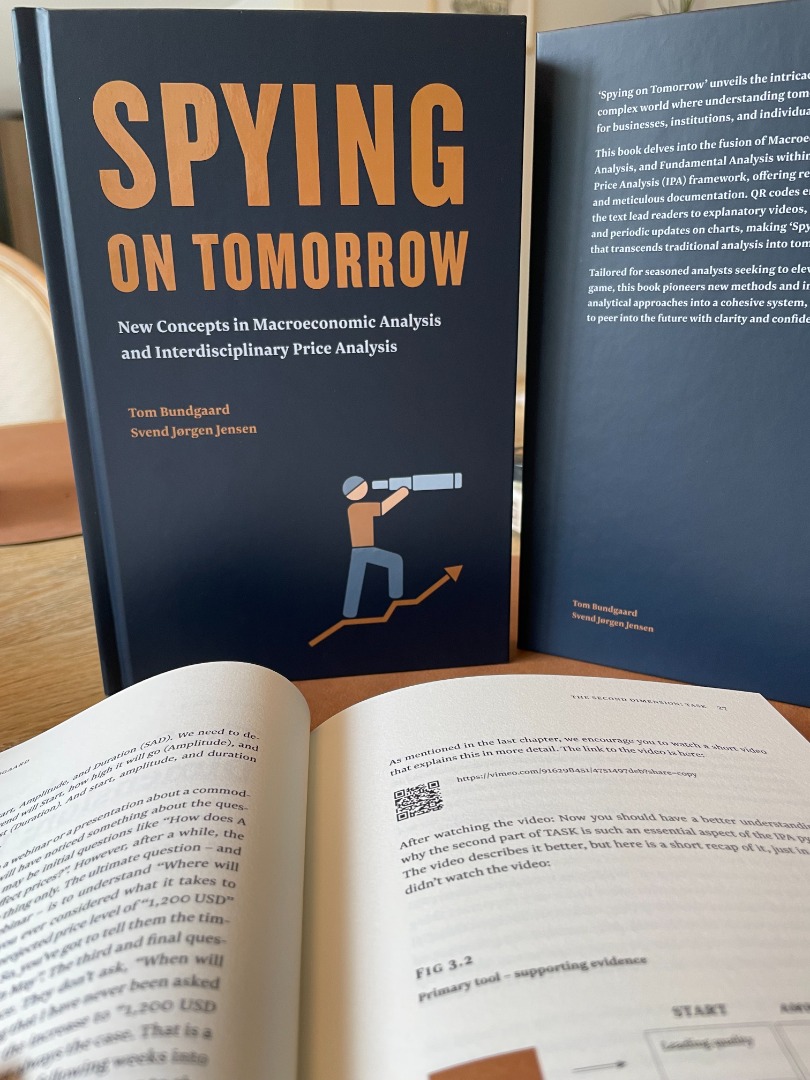
I´m proud to present our latest book Spying on Tomorrow written by Svend Jørgen and me.
It is easy to buy it on Amazon (for international readers). Click here:
https://www.amazon.com/Spying-Tomorrow-Concepts-Macroeconomic-Interdisciplinary/dp/8797493600
For a Danish audience, the book can also be bought on Amazon - or you can buy it here (only printed in English). Insert your name, email and comments and I will then get back to you to arrange the practical things.
The book costs 600 dkk (450 dkk + 30 dkk shipping for Danish customers + VAT).
Thanks
Tom Bundgaard
Im excited to show that my NEW book is released now....
Send me a message, and I will arrange for a copy to be sent to you.
Several years of writing have culminated in Spying on Tomorrow, a cooperation between Svend Jørgen Jensen and me. Our first book is sold out, and we are excited about this new one. This book aims to write only about new concepts and tools that havent been explored before. We assume you have a working understanding of fundamental, technical and macro analysis and we dedicate the books content to new tools, concepts, and ways of analysing. For that reason this book is ideal for all analysts, regardless whether you are a fundamental analyst, a technical analyst or a macro analyst. We are combining these perspectives in a new way in this book.
The first part of the book is a new, integrated way of analysing commodities or stocks from an IPA perspective - Interdisciplinary Price Analysis - written by me
The second part of the book is a new way of analysing the macroeconomy - written by Svend Jørgen Jensen
As an example of "new concepts", we have added a pretty smart feature. We have added QR codes throughout the book that will lead you to videos explaining the graphs at a much deeper level. This is quite a unique way of combining the book with video, which is much better suited for detailed explanations of graphs. Furthermore, the books content will be updated in the future with these QR codes. The first update has already been published as a video.
_________________________________________________________________________________________________________________________________________________________________________________________________________________
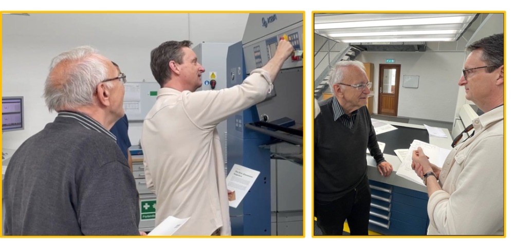
The two authors at printing start at Narayana Press. I got to push the start button on the press, giving me at least the illusion that I participated in the printing :-)
We were very impressed with the printers and the facilities, making this an excellent experience. Finally, on print!
_________________________________________________________________________________________________________________________________________________________________________________________________________________
10. September 2020
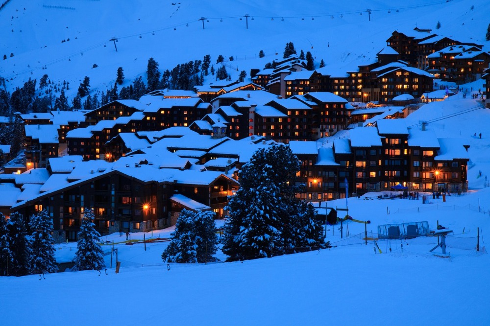
My job as an Italian Security Officer
- how to explain your work in an analogy
I have an analogy that “may” be helpful. You see, I have been struggling to explain how I forecast and especially how I could forecast the 2020 recession. Naturally, business people as well as family and friends ask me the crucial question “How could you forecast the 2020 recession?” – regardless whether I was right or wrong about the forecast. The problem is that this question is immediately followed with the next “Did you foresee the Corona virus?”. And when I say that “Of course I could not forecast the Corona virus”, then they simply don’t understand how I could forecast the recession. So you see how I have been struggling with an easy-to-understand explanation, and I may just have found this very thing.
During summer 2020 I had an uncle asking me the above question – How could you forecast the recession – and again I was struggling with an answer. He asked because I told him about the “coming recession” already in August 2019, so in summer 2020 he was naturally curious – but I was, as always, struggling with an answer when suddenly an analogy popped up in my head, and it made sense. I am very big on analogies in general – almost to a fault, and it can drive people to frustration sometimes – but there is just something satisfying about looking at the situation from a completely different frame of reference that gives a new understanding. So let me try this analogy for you and see whether you like it or not.
The answer I came up with is this: “The best answer would be to drag you to my office and then over an hour I can show you all the analytical tools and by the end of this you will sort of get the idea and understand how we can forecast. That is a good solution, but it is quite impractical and time-consuming – especially with a casual question that only expects a short answer. That is where the analogy comes in handy. So here it goes: I’m a Security Officer working at an Italian ski resort….”
News clip from December 2019: “Rome (CNN) - At least four people are dead after two avalanches struck the Italian Alps over the weekend”.
That is a terrible situation, and I have a job as a Security Officer at an Italian ski resort (not the one getting hit, of course). My job is to prevent people getting killed by avalanches. Then one morning my analysis shows that I need to seal off slope no 3 and warn that no-one is allowed to ski there. I’m not getting popular with this call, because slope no 3 is a good slope for skiing, but we have to do it for security reasons. Later that day, or the next, there is a big avalanche in slope no 3, and no-one gets hit. My job is done well. Then one of the guests ask me “How could you forecast this avalanche?” and immediately the guest add “I read that it was a snow scooter that started the avalanche. Did you know beforehand that it would be a snow scooter that triggered the avalanche?”.
The reply is that the “trigger” is not important, but the “underlying conditions” are. The trigger of the avalanche could be a snow scooter, or a hunter firing a gun or a rescue chopper flying low or a million other reasons. Don’t get hung up about the trigger, regardless whether it is Covid-19 or something else, because it is impossible to forecast. What you CAN do, is focus on the underlying conditions. And in this case on slope no 3 there were 2,2 meters of snow. In normal conditions the safety limit is 1 meter - given the steepness of slope 3 (the steeper the slope the more risk of an avalanche). However, during the last days, the snow layer got to 2,2 meters which is unsafe. Then the wind shifted to the north, and that is adding to the risk (wind direction matters in avalanches) and the weather forecast said that a temperature shift was coming during the day (temperature changes the composition of the snow). You now have so many “stacked evidence” that all points to a huge risk of an avalanche that the only sane thing to do would be to shut down the slope. Easy. Whether the avalanche gets triggered by a gunshot or a snow scooter or a helicopter is irrelevant, isn’t it? People get far too much hung up about the trigger and way too little about the underlying conditions. Once you understand the conditions, you know the risk.
Now, I don’t know if you like analogies, but the benefit is that in one minute I’m able to tell a story that makes people go “Aah, I get it” – without going through the whole 1 hour technical tour de analysis. It’s short, it’s graphic and it’s satisfying.
All analogies should be treated as an avocado: “Don’t squeeze it too hard”. At some point all analogies will break and get mushy, of course – after all it is only an analogy. The point where this particular analogy breaks or gets mushy is the timing of when I give the warning and seal off slope no 3. As a Security Officer I would be reckless if I waited until the risk was at 95 (on a scale from 0-100). I would seal off the slope way before 95 in order not to risk anyone’s life. However, in forecasting recessions it is – strangely enough and wrongly – the other way around. If you are too early and call for a recession (that doesn’t come, or comes later) you don’t get points for being careful but you get ridiculed instead. For that very reason I’m very careful not to use the R-word until the risk is at 95 where I’m as certain as possible – in order to save my own behind. But clearly you can see that is wrong, and it shouldn’t be like that. That is, however, how it is, and I just have to play along, so I'll wait until I’m “very certain” (although you can never be fully certain) and that happened in August 2019 where I sealed off slope no 3. Well, unfortunately I didn’t “seal off” because I can only inform and warn, as I cannot physically seal off the area.
So there you go. I’m simply a Security Officer at an Italian ski resort, trying to help people and warn about avalanches. That job involves monitoring snow layers, wind directions, temperatures etc. It involves a lot of computer screens, weather forecasts, but also trudging up the mountain to measure the snow depths – all while the tourists are skiing past me having a good time…


5. April 2020
An extreme recession in 2020?
I will show you a recession in 2020, and I will show you a model that the old masters used. (If you just want the answer without the models then skip to the end :-)
“Mean” has different meanings, so it’s tricky in English. You can be mean to someone (which is bad), or you can “mean something to someone” which is very, very good. Today we will discuss a third option for the word “mean” as “A middle point between extremes”, as defined by Webster. We are simply looking for “the mean”, the middle point, the balance. Once you find the balance point, you can correctly understand all the fluctuations in the world of finance.
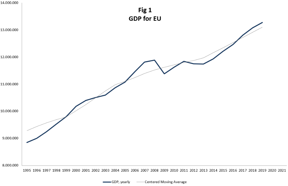
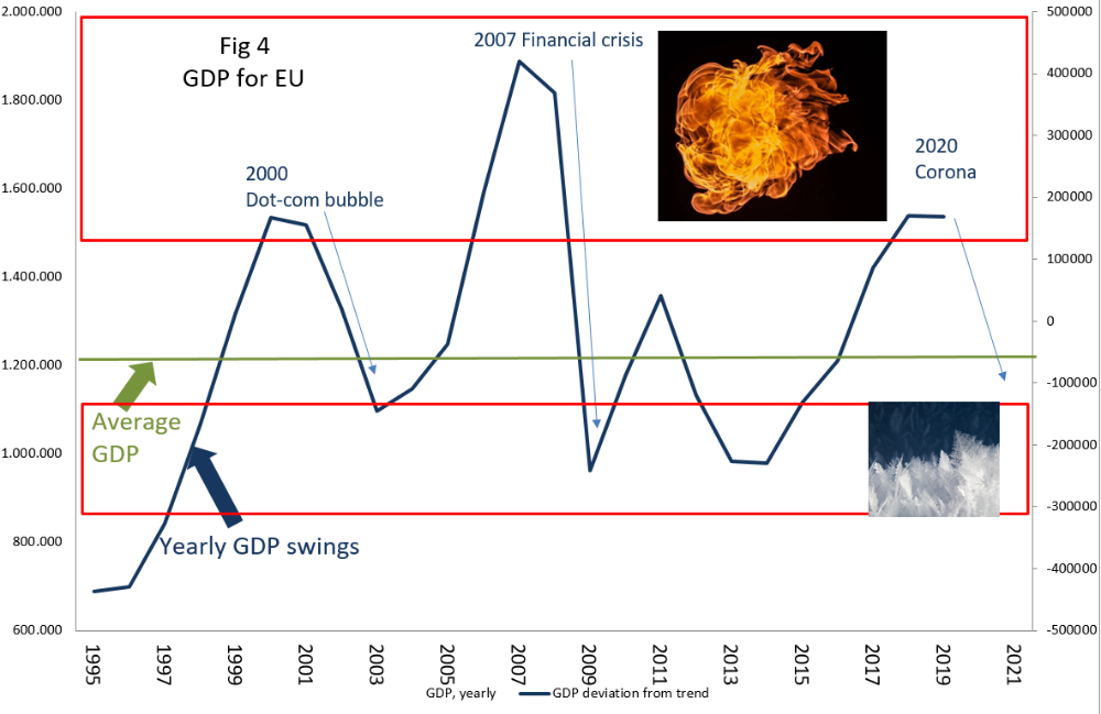
Figure no 1 is the GDP of EU. It shows an ever-increasing curve where the society gets richer all the time. That is the positive news, because this curve will continue to increase over the next 100 years as well. Society is richer today than it was just before the financial crisis, and this upward trajectory is nice.
Did you notice the grey line in the middle? That is the “mean”. The average. What can we do with that line? Notice how the GDP fluctuates “around” the mean. When the GDP is higher than the mean (like in 2008) we have a booming economy. When the GDP break below the mean (like in 2009) we have a bad economy or recession. In the graph it looks like very small deviations from the mean but believe me it is very significant. We will get to that in a minute.
How do we calculate the mean?
In this example we take 9 years of GDP and make an average. That is just adding 9 numbers and dividing by 9. But what do we do with this average? We place it “in the middle”, at number 5. That is called “Centered Moving Average” which is totally different than “Simple Moving Average”. The Centered Moving Average is a tool in macro economy that the old masters have used, whereas the Simple Moving Average is a technical analysis tool, and the way to use that is totally different.
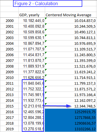
We placed the average at year no 5. We now take another 9 years GDP from year 2 to 10, calculate the average and place it in the middle - at year no 6. And we just continue like this. This will create an average that is “centered”. See the Figure 2 for the calculation.
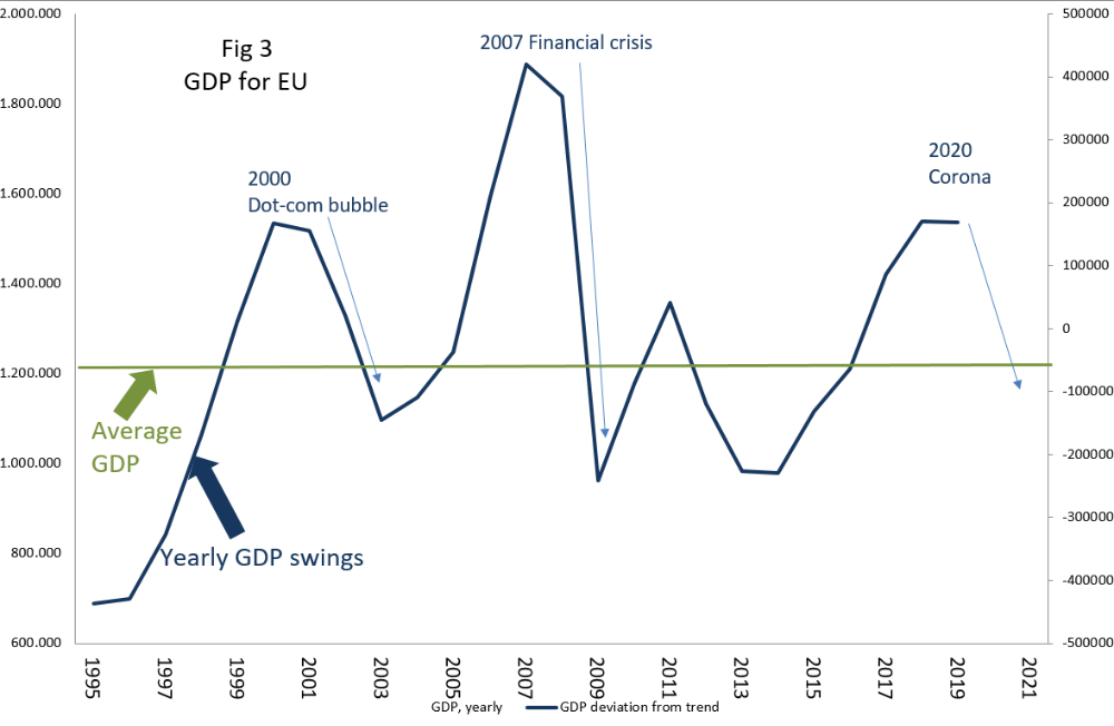
Figure 3 shows what happens when you subtract the GDP from the mean. Now we get very big fluctuations around the mean. Anything above the middle line is a booming economy. Anything below the line is a recession or at least a slowdown.
It is worth noting that the mean (the zero line) is horizontal in the graph. However, do remember that this line is actually increasing like you see in Figure 1. GDP and the mean will always increase on the long term. If you remember that, then you can mentally accept that here in Figure 3 the line is flat, horizontal.
A man and a dog
It is helpful to think of the economy as a dog on a leash. The man is “the mean” and he is walking straight along the path at zero. But the dog is sniffing around and sometimes it goes to the left (above zero) and sometimes it goes to the right of the man (below zero). There is a limit to how far away the dog can go because it is on a leash. The leash is made of rubber, so if the dog is really interested in sniffing at something it can pull more and get farther away from the man - but this can only last for a short while. At some point the dog must return to the man again. That is called Mean Reversion. The economy always fluctuates around the mean - both above and below.
Exteme zones
The economy has extreme zones where it cannot stay for long. These zones are marked in Figure 4. The top end is the “hot zone” where the temperature is too high. If the economy stays here for too long it will get cooked, and so it must retreat to the man at the middle. The lower part is the “cold zone” where the economy is freezing. If the economy stays here for too long it will freeze to a standstill and die, and so it must retreat to the man at the middle.
It is important to note how a visit to the hot zone is almost always followed with a visit to the cold zone. That is how mean reversion works. The economy is never at a standstill just like your breathing is never at a standstill (because then you are dead). The economy is not dead and so it has to continue to breathe - up and down - entering above and below the mean.
Making sense of it all
By now you can see how easy it is to see that 2019 (data for the complete year) is already in the hot zone. By definition it is just a matter of time before the economy has to retreat and start a decline into the cold zone. It is unavoidable. It is very seldom you have a tool that can say something as categorically as that. You cannot avoid a recession, and with this tool you now know it. No, you cannot predict exactly “when” it will happen. You just know it WILL happen. The “when” is another tool. The economy could well have increased further in 2020, going higher because of the dogs’ rubber leash, and then the recession would start in 2021. That is an option. The timing of “when” requires another tool (and I will likely go into that another time). But it is good to know that the economy in 2019 was very far away from the middle and that it has to return, and it was just a question of time.
Sugar tops
Many people are saying to me: “Well, you couldn’t predict that the Corona virus would hit and start the recession”. No, I could not. The “reason” for the decline is always different. That is why tops are always given a name. Just like every mountain is given a name like Matterhorn or Everest. The 2007 peak was called the start of the Financial recession. The one before that was the dot.com bubble. Every peak is given a name. I have said about this 2019 peak: “I don’t know what we will call this peak and recession - we just know it is coming”. My analogy is like this: Every peak is like a piece of sugar candy. They have different flavours - mint, strawberry, toffee. The main ingredient is, however, ALWAYS sugar. The taste might be different, but the content is always the same.
Funny enough, no-one calls the troughs anything. I think they deserve a name too. Just like the deepest part of the ocean floor is called the Mariana trench. I think the low point in the economy should be called something positive as to what made the economy increase.
USA
You may say that the EU data is too short to establish good hot and cold zones and you are right. Another time I will show the US zones, but there are too many graphs in this blog already.
If you study this method you get a sense - not a rule but a rough idea - that extreme hot zones are often followed by equally extreme cold zones. The harder you throw something up, the harder it will be coming down.
“We didn’t know”
After the final recession started in 2007 and 2008 we heard a renowned economist say in public: “We didn’t realize that the economy was THAT much out of alignment”. We marvelled at that statement. How could they not know? It was plainly evident. Not just in the EU GDP but also in the US. It literally screamed hot zone, and the dog had even pulled the rubber leash to its extreme. There could only be one outcome of that - but the economists didn’t realize that. Simply because they don’t use this method that I have just shown you. A brilliant method that I cannot claim to have invented, because it was used by all the old masters. Why not use it when it is so blatantly good?
A technical remark here at the end about something you may have wondered. When we make a Centeret Moving Average we don’t have the last 4 years of CMA data. We will only get the mean for 2019 in 2023. Naturally we don’t have patience to wait that many years, so we have to “prolong” the mean artificially in the last 4 years. That can be done manually by using the general percent increase, or it can be done much more mathematically by a Hodrick-Prescott filter. Perhaps we can go through this another time. You just need to know that the last 4 years to “now” is always a rough guide that can never be truly known, but can be assessed to an acceptable degree.
Are we heading to a recession?
Now to your questions:
Are we heading to a recession in 2020: From the graph, yes! It cannot be any different. It didn’t HAVE to be in 2020, but it was coming anyway, and the Corona virus was just the trigger for the avalanche to start.
Where are we heading? To the cold zone, of course. Just like we have seen over and over again. The GDP was in the hot zone but not in the extreme end, so we don’t necessarily have to go to the extreme end of the cold zone, but anything’s possible. We are, however, heading to the cold zone.
How long will this last: Remember, “timing” is another tool. This tool just tells us where we are going.
Will the economy recover again?: Yes, certainly. It always does.
Now take a break. Take your dog for a walk – and see how many times it want to crisscross from one side of the path to the other…

If you don't want to miss an update, then simply subscribe! It's free. But I must warn you that I'm writing very infrequently. It rains when it rains :-)
The blog should be calorie-free and non-fattening :-) It might exercise your brain cells, or it might cause you to look up and say "hmmm" (which is the highest praise I could get).
11. January 2020
DAX 2019 revisited - let's see how it went
A year has passed since my forecasting the DAX for 2019, and what better time to see how 2019 went than now in January 2020?
The grey lines in the graph on the right shows the rough scenario I painted in January 2019 (the grey scenario, see the post), and now the real DAX movements are on the chart. Have a look...
How did it go? Well, not quite bad. It certainly wasn't perfect, especially the expected deep decline in summer that turned out to be a smaller decline - but a decline, nonetheless. The following increase is also quite spot on, but the DAX has clearly increased a bit more than the grey projection. But all in all I'm pretty satisfied with it. The astute Elliotician will notice that the labels have changed, giving a different perspective, or probability than the old. But then we are looking into 2020, and that is not the job today.
You may ask if I profited from this? Well, sadly no. I was busy doing other stuff, so I didn't really get around to trading the DAX. Looking at the graph I clearly should have, but that's the "fish that got away".
I like transparency. Try to follow up on your own research and forecasting and the learning will be worth it. I learned something from the less deep decline during summer, and the possible new Elliott wave count...and that you bloody well have to act on your own research, darn it! Now it is your turn...

6. December 2019
Why are we analysing the market?
I have come to ponder "Why do we analyse the markets, and why do I enjoy it so much?". Especially the word "joy" is important. Humans are not meant to work just to pay the rent. We are meant to work with something that intrigue us, something that is a challenge and a joy at the same time, something we can lose ourselves in. For some reason all of that is summed up in analysis, for me.
I knew a very gifted clarinet musician that worked with discipline with the music, and he loved it the same way. For someone else it is working with children - which in my view is something of the highest and most worthy aspiration. I just dont think we "choose" what we are fascinated by. It just happens. We also dont choose who we fall in love with. It just happens some magical way. But we are not here to talk about marriage, music or children - although we should do that some other time. The topic is working with analysis.
I am fascinated by craftsmen. I watch Japanese carpenters make incredible workmanship with wood and their tools. I watch David Bull make woodblock printing which is part craft knowledge and part art. And whenever I watch this, I recognize their commitment and craft in my own work. I am just as dedicated and disciplined, and analysis is also partly a craft knowledge and part "art" (call it symmetry, gut feeling, alignment, sensing or whatever term you like).
My tool is not a chisel or a Japanese Hangi-to. I would love if "my craft" used this kind of tangible chisel tools as well as thick cherry wood to cut. Alas, my craft is without tangible tools. I use a computer, a mouse and a keyboard - and my eyes and wit. But in the computer I use virtual tools like trendlines, mathematical equations overlaid on the price chart etc. So, I have my arrangement of tools as well, although they are less tangible than a physical chisel. That way I feel connected to the old craftsmen that worked all their life making useful craft, and developing their skills along the way. Knowing that there is always more to learn from the craft, more to pour into the craft. This is a two-way pump, working both ways, and thats the way it has always been if done right. You learn from doing the craft, and what you learn you pour into your next project.
So I analyse the market because Im a craftsman, and I cant help it because that is what is creating joy and development. I know this is centring on me, so the question should also be what others get out of it. It is like a craftsman that I met in Canada. I liked him right away, and he sold me a beautiful wooden cutting board for the kitchen. The board had cherry, maple and oak wood fused together into a beautiful cutting board. That is his craft and joy. And I get to cut vegetables on this beautiful cutting board, enjoying the marvellous work and details, remembering him and his craft. The same way someone else should get something out of the craft I do. You may like this particular cutting board, or you may prefer to buy it elsewhere because you prefer plastic cutting boards. There is no judgement in that. Plastic boards are fine. But here you get wooden cutting boards made from maple and in my design, and there is always a select group of people who appreciate that kind of craft.


21. January 2019
DAX bear market or not - aim for 2019
It has been a while since we’ve looked at the biggest stock index of Europe, the DAX. The question we will tackle today is whether the DAX is in a bear market, and what to expect in 2019.
It’s quite infrequent that I post anything about the DAX or the day-to-day stock market. I could do that, but I want my blog to be 80% about the science, the methods and the tools, and max. 20% on actually forecasting. In my day job I have plenty of real-life forecasting, and I don’t want the blog to become just a free forecasting service. But I’m thinking: Those that are brave enough to come and read my blog (the very few, brave people) they should at least get “some” bonus in the form of actual forecast. So today I will try to forecast the DAX.
Before you read my forecast for 2019 you may want to see my previous DAX forecast. I did that in 2017 (trying at least once a year to give an outlook). At least my previous forecast gives a real track record of how the forecast went. In fact, the forecast was so nice and spot on that I’m a bit cringy about mentioning it. But anyway, I guess only one person out of a thousand will go back and check, and in that case the link is here:
https://www.tombundgaard.com/the-dax-downhill--when-is-it-stopping/
DAX in a bear market?
I have seen so many articles discussing “Is the DAX in a bear market?”. None of these debates make sense to me. The term “bear market” is totally arbitrary set as 20% decline (a “correction” is set as 10%) and these percentages doesn’t make sense to me. These two percentages are really not a measurement of anything. Instead I use the term “Downtrend”. Is the DAX in a long term downtrend - meaning a decline that typically last 1-3 years? That is a far better description. And yes, the DAX gave the signal of a (bear market) long term downtrend in April 2018. That is 9 months ago. So why do people still talk about it today as if it is an open question? It’s done, and we got the signal 9 months ago.
Let me clarify the signal I just mentioned. The graph on the right shows the monthly price with moving average, MACD, RSI etc. The same type of setup I had in my above mentioned forecast from 2017. There are two parts to a downtrend: First a break below the long moving average, and then later a break below the MACD red line (just below the price graph). The last and final signal of the MACD came in April 2018. Since that point there was no ambiguity of the direction, and no “bear market discussion”. My point is just this: Once you use technical analysis in this way, there is no need to waste time on meaningless questions and ambiguity. You have a signal.
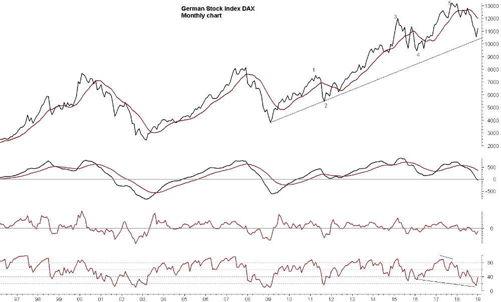
How long is the downtrend going to last?
Now this is a much better question. How long is the downtrend going to last? A MACD signal of a downtrend means “1-3 years of decline, but a minimum of 1 year”. This is very often 2-3+ years for commodities, and normally a shorter time period for stocks, perhaps 1 year or a bit more. So when was the DAX peak? Mid January 2018 - exactly 1 year ago. Happy birthday! Light the candle on the cake.
As mentioned, the minimum requirement of a MACD signal is that the DAX should fall one year. So the DAX has just fulfilled that promise here in January 2019. We don’t exclude that the downtrend can last 2 years, or even 3 years, but we just know that we are dealing with a minimum of 1 year, and that is now done. Think what the general stock owner could have saved, if this MACD signal and outlook were commonly known.
What is going to happen in 2019?
Now this third question is much better - and much harder to answer: What is going to happen to the DAX in 2019? This is where we start to forecast. This is so much more interesting than “DAX in bear market?”.
Let’s look at what the technical signal says. The RSI is hitting the 20 mark recently (in the monthly graph). It took a year for the RSI to work its way from above 80 to 20. And the concept of 20 means that the DAX is currently in the last phase of the downtrend. The idea is that the DAX is in the final perhaps 10% of the overall decline. But the RSI doesn’t do more precise timing than that (then you need other tools). So the low point can either be right now at 20 (so the DAX will start to increase right now) or we will see a divergence (a little bit lower DAX in the coming months, where the RSI start to increase as a divergence signal).
The black trendline in the monthly graph could be a possible low point/turning point. The DAX doesn’t have to hit it completely, but is represent a good idea of a support zone that we don’t expect to be broken (not yet, but later). I didn’t draw any fibonacci, which would be a good idea, but I’m trying to not do too many technical tools.
Another thing to notice is that the RSI is making a “hidden divergence”. The RSI is lower than a previous low, but the DAX is not. This implies an underlying upward pressure starting to build.
Conclusion for the monthly graph: The indicators show that most likely the majority of the decline from January 2018 is done, and the DAX has only roughly 0-10% more decline ahead.
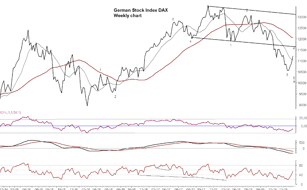
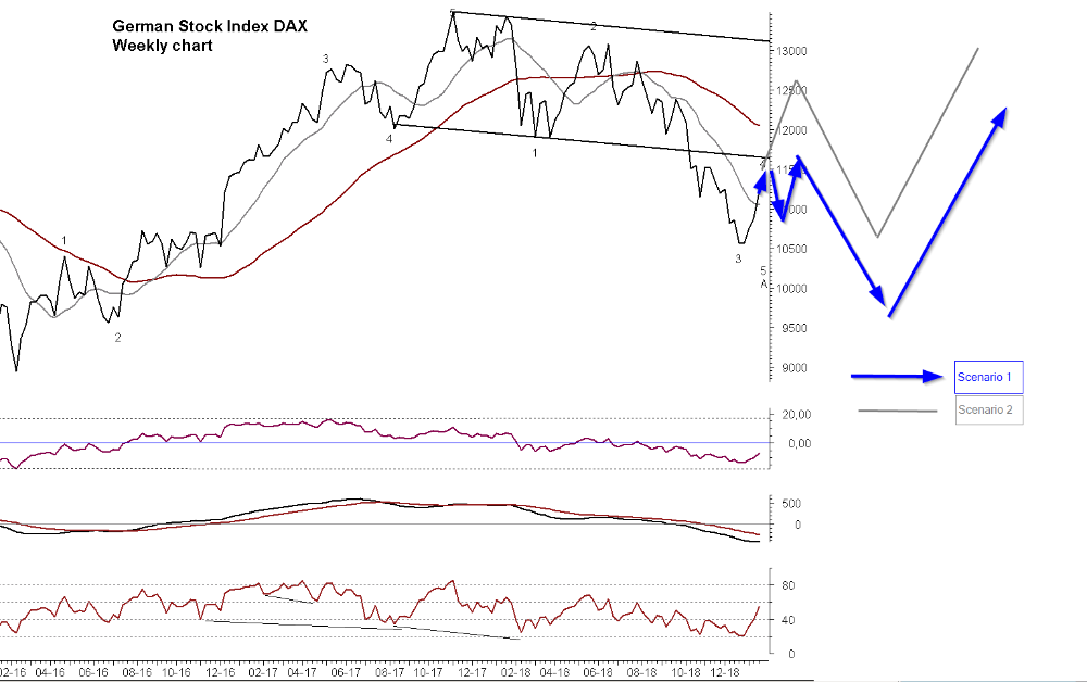
Weekly graph
The 2nd graph (weekly graph) shows that the DAX has just crossed above the short moving average. This means an end to the previous short term downtrend. A lesson that we all have to learn again and again is that we don’t “assume” a downtrend is over as long as it is below the moving average. Don’t try to pick a bottom. But with the current break above the moving average I have placed a number “3” at the current low point in January 2019. This comes from Elliott Waves (I have other blog posts about this tool). You can see my Elliott wave count further back in time on the graph. I can’t testify that this is a good count, but it is “my count”. If this count is correct (to be seen), then we have hit a 3 low point, and then we are going to see a 4 (abc) increase in spring 2019, and then a 5th wave that is going even lower, but possibly only mildly lower than today.
Once the 5th wave is done, we could potentially be at an A low, looking for a B increase (followed with a C decline). Now all of this only makes sense if you are an Elliott wave fan, so let me make it easy by showing the two possible outcomes on the 3rd graph.
After seeing the 3rd graph there is no need for further explanations. This gives the idea of what we are looking for (based on 2 scenarios, although there are more scenarios). Don’t take the timing and the targets too literally, it’s just meant as a rough guide. Just be totally clear that this is a “game plan” based on Elliott wave and the typical pattern we expect. A game plan need step-by-step verifications from other tools. And the MACD is important in this aspect. We may likely get a break above the weekly MACD (if the plan is correct), but we don’t necessarily expect a break above the monthly MACD. The meaning of that mumbo-jumbo is that any increase is likely short to medium term, but not the start of a really new long term uptrend (1-3 years).
Overall conclusion
The most important outcome from the analysis is perhaps this: We cannot expect the “one-sided decline” to continue. We are likely going to see much more up/down movements (both short and medium term upward corrections) than what we saw in 2018. So we cannot go completely short or completely long and forget to monitor the market, but we have to stay more nimble now. In 2018 you could just have gone short and forget about everything for a year. That is likely to change in 2019.
What am I missing in my forecast? Oh, I only miss just about the most important thing that I always stress again and again: We don’t build a forecast from just one model - never! I’m only using technical analysis (and only a fraction of it). I am not using the fundamentals, the macro economics and the cycle analysis. That is a minimum requirement for giving a solid forecast. But this post would then be so much longer. So consider this a partial forecast only, based solely on technical analysis. That is also what I did in my last analysis (you can see how that went with the above link). So now it is up to you to monitor the markets and the signals in 2019.

15. December 2018
"What is your track record" - part 2
Sorry about the long wait. Life has a way of taking you places, and I have been busy with several things…but here is the second part of “Track record”.
I said that I would show you a practical example of my own track record. I learn much more from practical examples than mere theory, so I will show you my track record for Brent oil.
I really don’t want to pick an example where “everything was hit 100%”. That would just be distasteful. And there is also no point in showing an example where I got it totally wrong. So in this Brent oil example you get a mixture. I will show you the good, the bad and the ugly.
The good
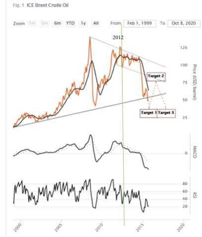
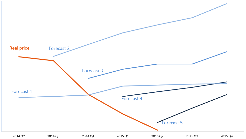
If my only concern was to “look good” and be impressive, then I would show this long term forecast for Brent oil - see the graph no 1. This forecast was made in 2014, showing a Target 1 low point to come “late 2015, early 2016 at roughly 40 USD”, and then Target 2 shows an increase to a “Q3 2018 peak at 60-80 USD”.
How would you rate the accuracy of this? The low point came January 2016 at 38 USD, and the peak came in October 2018 at 84 USD. Yes, the peak came 3 days into Q4 and not in Q3, but 3 days is acceptable, right :-) And yes the peak came 4 USD higher than 80 USD, but all in all this is rather accurate - seeing as this is a forecast made in early 2014. Graph no 2 shows the real price movement. All in all practically a “bulls- eye”. Now let’s look at the bad...
The bad
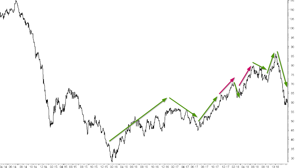
Will our forecast for Brent oil continue to be impressive if we look at the medium term forecast? Oh yes - it is not enough to forecast long term price movements for brent. You also need to forecast the medium term movements of 3-6 months trends. So we can now see the track record for that.
Graph 2 shows green arrows (where the forecast was right and on track), and red trend arrows (where it was not on track). You can see that there was a good number of green arrows, but I didn’t quite get all the movements right. The red arrows shows extraordinary straight increase where I thought we could see some zigzag movement instead. I knew that prices would eventually go up, but I just didn’t expect such an unrelenting increase without some zigzags. So the red arrows will diminish my track record.
The Ugly
Now to the ugly part. Yes, exactly - the part that no-one normally shows you. A forecast is fine, but I’m a practical guy. It also needs to be followed up with practical action - i.e hedging oil price (or buying the stock you forecasted). Without action there is no benefit. My recommendations are normally stated as “Initiate” where you definitely have to do something, and “Consider” where I think there’s a good chance, but it is really up to your own judgement and risk tolerance. And when I look back at brent oil I had way too many “Consider” and too few “Initiate”. I simply were not bold enough. So the forecast was really good, but the practical hedging was so-so. True, I did say “consider” and that meant that you could have done something. But in the end I was not impressed with myself.
The important question here is: Should we make a track record of his “Forecast accuracy” or his “Hedging accuracy”? Can you see how I just pile more and more things on top of each other, and every piece is making “track records” more and more difficult. It started out as a quite simple exercise - mathematically clean and easy - and has ended with a chaotic tumble. That is why I don’t like track records.
The downright ugly
Now that we had a look a my track record for brent oil (mostly proud of it, but realizing that it is not perfect) we can take an example of a really ugly one. I don’t want to tell you who the forecasters are and what item they are forecasting. Let’s just say it is really high profile names and everything is public knowledge, and I have the facts for verification. I sometimes use examples like this when I’m doing workshops. I have gathered a great number of such examples.
Graph 3 shows the example of a real life forecast. There is a very interesting story to accompany this chart, but here I just show the bare facts: The quarterly forecast and where the real price went.
The forecasters here claimed that they were 95-99% accurate. Impressive, isn’t it? But if you look at the graph you may wonder how they come to 99% accuracy. Well, every quarter they only measure “this quarter”. They measure "How far did prices move away from the forecast this quarter”. They don’t measure this year or next year, or whether the direction was right or wrong. Only distance in this quarter. How about that? Is that a fair way to measure?
The really ugly part in graph 3 is that prices didn’t increase as they forecasted. Prices fell instead. How about that? So for 2 years in a row they made all the wrong forecasts, predicting uptrend after uptrend, but prices fell instead. And yet they were “95-99% accurate”.
Money
You are actually a bit wrong when you think this Graph 3 forecast is 0% accurate. I look at things in terms of money. You see, I know someone who followed the advice of the graph 3 forecast and lost money every time. Let us say I gave these 5 wrong forecasts and people lost money on each forecast. If I now have 5 bad forecasts (losing money) and the next forecast is good (earning money). Would you then say that I have a score of 1/6 or 17%? I would not. In my book I need to get 5 right where they capture all the losses they had. Once we are square at “nothing lost/nothing earned” then I can call my track record 0%. Tuff? You bet. But that is the reality. Someone lost money 5 times in a row, and you need to earn this money back before you are at square. So after 5 right forecasts you are square at 0% and then no. 6 right forecast is giving you a slightly better average than 0% accuracy.
So you see, now I’m piling yet another layer of complexity on top.
More...
By now I think you are perhaps convinced of my view that track records are a messy affair. If you were not convinced, you wouldn’t have read all of the above and gotten as far as this. The fact that you have made it so far means a lot.
At this point we don’t need to pile more complexities on top of the already high pile. There is really no need. But just to prove that I can continue, I’ll give just a few more hints at what I think should be done (if you really persisted on getting an accurate track record).
A. The accuracy percent should not be mixed together, but be separated in “uptrends” and “downtrends”. Let me take a concrete example. You will ideally sell your stock if I forecast a downtrend in the stock price. Let’s assume I forecast a 4 month downtrend, but the downtrend continues for 8 months, and gets 15% below my target. In that case my forecast was clearly not accurate...but the trend was right. Is that is a problem? Not really, because you sold the stock, you are out, and you’ve got your money. So the forecast accuracy is not that relevant in a downtrend. The TREND is important.
B. In an uptrend, however, the situation is in reverse. You buy the stock when I forecast an increase. So clearly you do not like the increase to be smaller and shorter than what I forecast, because my forecast was the premise you bought the stock on. So the forecast accuracy is much more important here. So you need to separate your forecast accuracy in uptrends and downtrends.
How to measure
Conclusion: You see what I’m doing? I’m taking a concept that you thought was really easy (“just measure the forecast accuracy”) and now I’m making it much, much more difficult - but also much more right. What do you want to measure?:
What a complicated mess! And I have now written 2 blogs on “track records” - which is a topic I really don’t care much for because of all the traps and egos and complexities. I just want to throw it all aside and wash my hands and start to do some really useful work - like analyzing the markets. And then two weeks later a guy says “Hmm, your work looks fine, but what is your track record?”. What should I tell him? All of this stuff in these two blogs? Too much! Or just give him a weak answer? You know what! I’ll direct him to this blog post. Then he can read it here, and I don’t have to go through it all with him. That’s what I’ll do. Great idea! Oh, is that why you are here??


You have reached the end of the line. The older blog posts have been moved to the Archive. Please click here to read them.
...but of course there's an exception. Below you'll find one more blog post (just one), which is the first blog post that started it all...
__________________________________________________________________________________________________________________________________________________________________
25. October 2015
Here it goes...
I finally got around to start my own blog. There is no better way to say it than that (and in that quote I give a nod to Jason, a fellow blogger in HK). I've been thinking about starting a blog, and although I have put it off for years it kept nagging at me. Even saying "Good idea, I might come around to doing a blog at some point" (an otherwise excellent 'postponing technique') did not make it go away, and I'm left at a place where I simply have to start. So here it goes. There's no aim for perfection, there's no room for academic language (makes me gag), and there's no other road than to get messy and involved in everything that strikes my fancy and interests me. I write for my desk drawer and an audience of one. Come to think of it, that may likely be the only way to write for many.
This blog may transform and morph during time. Everything does. Well, not everything, but everything "alive" does. But the idea is to start with financial analysis from two angles: 1. A tool based angle where I discuss my favorite combination of indicators and new revelations. Here I get to be nerdy. The second angle: 2. A commentary on various stock indices, commodities and macro economic developments as seen from the perspective of the tools. I don't expect an equal blend of these two, but look forward to see the shift between yin and yang in them.
I'll try to make each section short. I'm lying, I know, but I'm just starting out here, so cut me some slack. But I vouch to ramble and get off track once in a while, and then veer back on track again. Also I want to include photos in every section. This is a personal thing for me. As much as I like personal writing, I can't stand if it is too long or boring, or if it is without interesting photoes or graphs. My eye is visual like you won't believe, and I crave stimulus to keep me interested. So it seems you can expect "short ramblings with photoes". See, already here I'm a surprise to myself. Something I didn't really realize until now. So welcome to my experiment.


__________________________________________________________________________________________________________________________________________________________________