18. August 2016
The power of Multiple Time Frames
Four common rookie mistakes, and a look at where the DAX is heading, using daily, weekly and monthly time frames
I’ll go through daily, weekly and monthly charts to show the power of combining them, and I’ll go through four common mistakes. You might think "Uh, not another topic that I absolutely need to understand and implement". I get that. But basically there is no getting around using daily, weekly and monthly graphs if you are serious about technical analysis. But to make it more interesting I will analyze the DAX so we get the current view on the stock market. So let's dive in.
Multiple Time Frame Analysis
To use daily, weekly and monthly charts is called Multiple Time Frame Analysis, but that’s just a boring, theoretical name. I call it “the three generation method”, much like the picture of the hands you see at the top. The baby hand is fresh and without wrinkles, but not as wise as the old hand. So each time frame has its advantages and disadvantages, and that’s why we want to bring them together in a family council to get all the benefits.
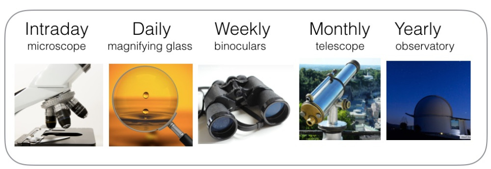
There is actually not only three time frames, but five. See the next picture, with intraday, daily, weekly, monthly and yearly. I regularly use all five, but in very different ways. In the picture you can see that I use microscope, binoculars etc., because all time frames give a “perspective” and an outlook on things. If your preferred timeframe is intraday, then you may have a good view on where the market is moving during the next two hours, but you have no clue what it is going to do over the next two years.
My personal take on it
My big disclaimer is that I will show you my personal settings. There is no ultimate right or wrong way, and you can choose your own. I don’t have any interest in going through all the theoretical possibilities, and I think it is much more to the point to simply show how I choose to do it, and then you can use that as inspiration and adapt and modify according to your own situation.
The power of using three generations
A daily chart refers to one dot per day/one candle per day/one price bar per day. It usually spans a year or two back in time, and so this is your perspective. An intraday chart covers perhaps a day or two back in time, and so this is a much more limited time span. A monthly chart has one price bar per month and covers a few decades. As a technician you already know this, so we can go straight to the benefits and how I use them:
The conclusion is: A longer timeframe holds more weight that a shorter time frame. This is true for the bigger trend, the reliability of the signals and for the perspective.
So based on this you have to choose the time frame you trade. I want most of my trades on the weekly time chart. This means that I trade the signals I see on the weekly chart, but I first examine the monthly chart for perspective and the bigger trend. Then I study the daily chart for a suitable entry. This is my preferred way. When I get impatient I allow myself to trade the daily time frame, but with less capital and for a shorter duration. In that “exception” I use the daily chart as my main time frame, and I study the weekly chart for perspective and the bigger trend, and I study the intraday chart for a suitable entry. So basically you find your time frame, and then work one level higher and one level lower. You don’t need to go two levels up. An intraday trader is interested in the next hours and the monthly chart is too far away and does not really give him any value regarding the next two hours. The jump is too big. So he needs one level higher, which is the daily chart.
What value can we wrestle from the current DAX, using different time frames?
Yearly chart:
I haven’t shown an example of this because this time frame is for nerds like me. I only use yearly charts when I go 100-200 years back in time, use logarithmic scale and investigate how prices react to macroeconomics etc. So this is for the nerdy and the really deep analysis. No need to show this here.
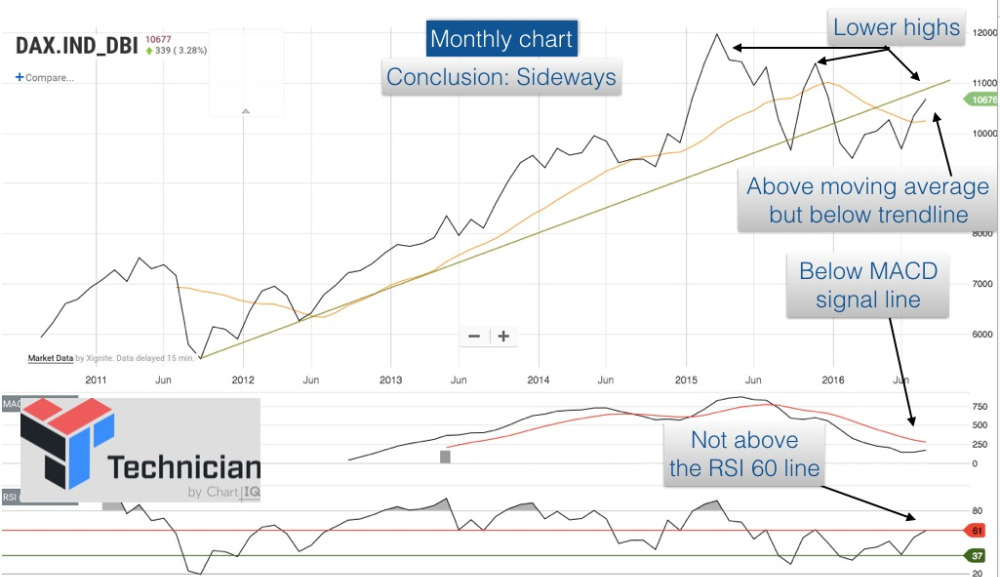
Monthly chart:
See the monthly chart on the right. For every chart I use different indicators and different settings. For example I use a 12 month moving average on the monthly chart, but a 50 day moving average on the daily chart. All my indicators are also fine tuned to the specific time frame that I’m looking at. The RSI is different on a monthly chart than on a weekly chart etc. This is simply a process of testing and fine tuning.
The whole idea about the different settings is that it is easy for prices to "peek above" a 50 day moving average in the daily chart as a false break, and then prices reverse and falls again. These false signals are reduced a lot in the weekly chart with a 13 week moving average, and this reduction of false signals is a clear advantage on the longer time frames.
If you study the pointers I have put on the monthly chart you can see a series of breaks above and below the moving average. This is what we have to expect in a sideways trend. The RSI is between 40-60 and this is confirmation of a sideways trend. The MACD is below the signal line, and this means that the current price action above the moving average is not a valid buy signal. The overall conclusion is that we are having a sideways trend.
A sideways trend sounds so very inconclusive for many, but thinking this is a mistake. Instead it is a hard fact that carries a very specific set of rules. In my strategy I sell the DAX at the break below the MACD signal line. This reduces the risk of a true bear market. When the indicators later show that this is a sideways trend, then I am allowed to buy again. But only for the short term as each up/down swing has a short duration. And I need to exit again when we hit an RSI 60 peak and the stock shows weakening signals. And I cannot go all in on the stock market, but only use a limited position size. A big position size requires a confirmed uptrend (long) or downtrend (short), whereas a sideways trend is for short term plays only. So you can see that a sideways trend can be used in a very specific way according to your investment strategy.
Weekly chart:
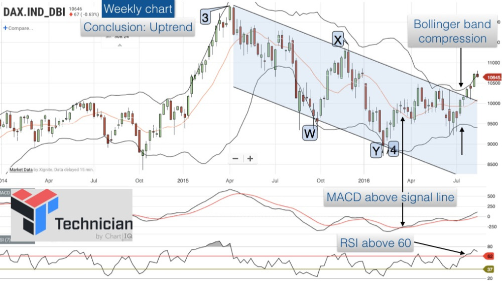
On the weekly chart I like to show candle sticks instead of a line chart. I also like to show the bollinger band as an addition to the MACD and RSI I already have on the monthly chart. I also like to use the weekly chart for Elliott Wave counts. So you can see that this time frame offers much extra information.
The weekly chart shows a clear uptrend with a bollinger band compression and a break out of the trendline channel, confirmed by the RSI and the moving average. So we are dealing with a true uptrend.
Daily chart:
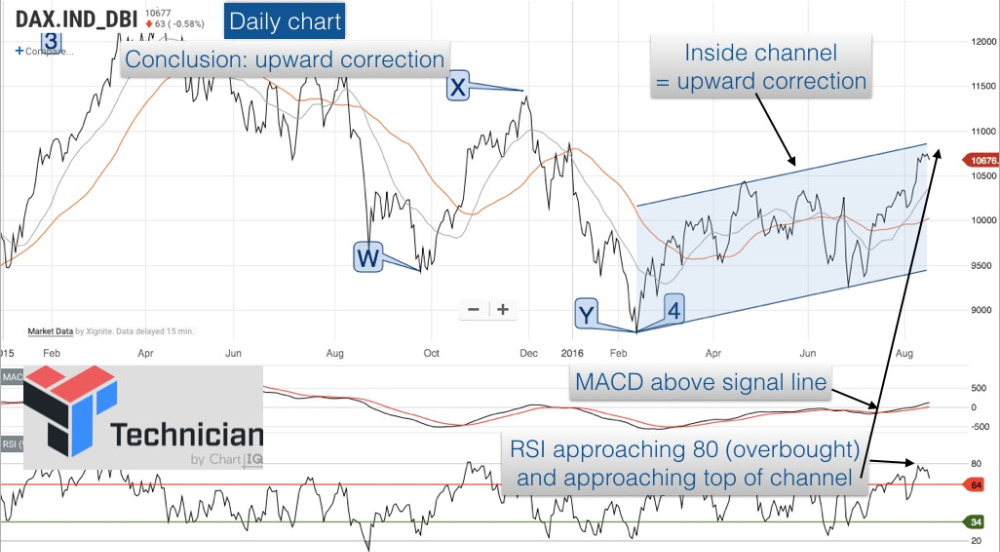
I show a different trendline channel in this graph (also a Kennedy Channeling Technique), but as a shorter trend. The weak nature of the current uptrend can be seen in that prices are still contained within the parallel lines. The upside potential seems to be quite limited at present because the RSI is high in combination with a price action that is approaching the top trendline. So I need to be cautious right now. The conclusion is that the buy signal on 12. July (a break above two moving averages) was a great entry point, but a month later at 18. August (today) the upside potential is diminishing fast. The increase can indeed continue a bit longer, but the risk/reward ratio looks much more dim now.
Intraday chart:
Intraday charts is not “one thing”, but consists of 5 minute charts, 10 minute charts and so on up to hourly charts, 2 hours charts, 4 hour charts. There’s so many to choose from, so you’ve got to have “an angle”. Your main time frame could perhaps be an hourly chart, and your shorter time frame is a 5-minute chart and your longer time frame is the daily chart. But that is just an example.
I’m going to be quite unpopular when I say that I don’t like intraday trading. The signals are not reliable, not correlated to the bigger trends and to the macroeconomic development and so we don’t have the tailwind from the big events. But that’s just my opinion, and it’s conditioned because I have been working with long term time frames from the start based on my mentor. I’m really grateful for that approach, and it just means that I’m not good with intraday things. But in all fairness I have to mention that I have seen for hours and hours on end how Tom Hougaard trade intraday charts, and I’m really impressed. It opened my eyes for the fact that it is actually possible to trade professionally on an intraday basis. In my eyes he’s a true gunslinger. By going so deep into intraday action he is consciously choosing to limit himself and have no tailwind from the bigger trends etc. So the fact that he can pull it off just shows how good a gunslinger he is.
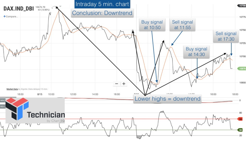
I have included a 5-minute intraday chart and it is quite fun. It shows a buy signal at 10:50 and a sell signal at 11:55 and so on throughout the day. But the value I can gain from an intraday chart (as I’m a weekly chart guy) is that the intraday is showing “lower highs”. So prices are basically in a downtrend throughout the day. That relates to the warning we had on the daily chart that most of the upside has been achieved. So the intraday chart just reinforces the caution I get from the daily chart.
Normally I only follow the intraday charts during the first days after a buy, just to see “how is it going”. But if the trade goes well, then within a few days I don’t need intraday any more but switch to the daily chart. If it goes really well and I’m in a long term trade, then I also stop looking at the daily chart for quite a while and only look at the weekly chart.
Comparison chart:
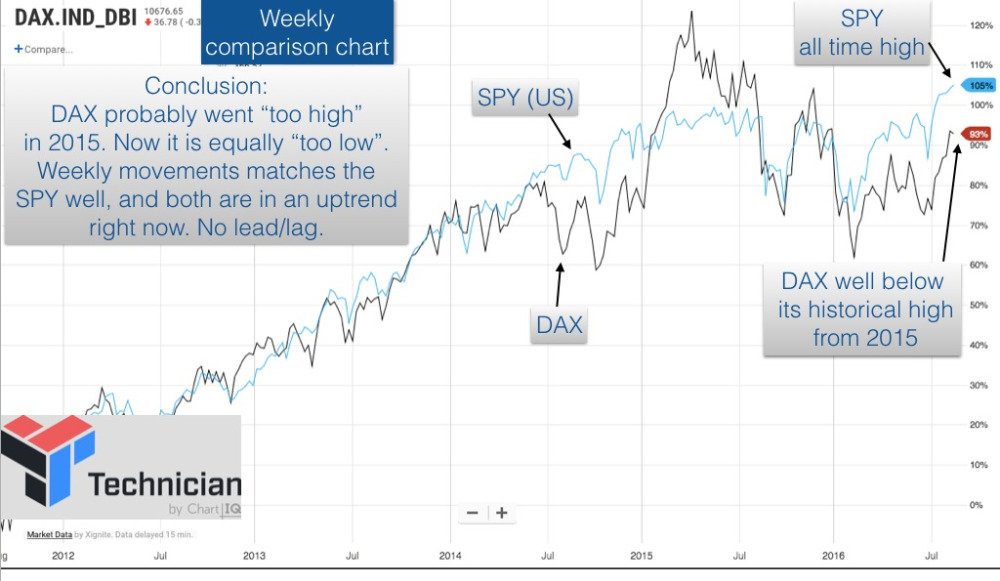
I have enclosed a single example of a comparison chart. I compare SPY to the DAX to see how the US and EU stock market is performing in relative terms. This is not about “time frames” so I just show a single example of how we need to look at intermarket analysis as well. I study much more than the SPY, so this is just a single example.
Creating your charts
You need to make your own charts and find the tools and settings that work for you. The charts I show have been made using “Technician”. It's a free software I have recently found and I just tried it here. I already like it a lot. It has certainly been able to make the charts on different time frames, and it's quite good and flexible. I don't have any affiliation with them, but simply stumbled upon it. It’s a great online tool and on top of that it’s free. So that can be a great resource if you are starting out and need a good tool.
The conclusion of the DAX
At this point you are probably a bit confused at the DAX message. The different time frames give us conflicting views, and that is normal. So let’s unravel the threads:
Monthly - A sideways trend
Weekly - An uptrend
Daily - A weak upward correction
Intraday - A downtrend
This may sound contradictory, but it’s not. I like the contradictions because it gives me a chance to clear this up. The contradictions is a point that bothers and irritates many traders, but we simply have to put things in the right perspective.
The standard phrase you always hear is “The trend is your friend”. That is true, but which of the above trends are they referring to? Is my friend sideways (monthly), up (weekly) or down (intraday)? We’ve got them all!! So, go on, tell me, what trend is my friend??
I really like the saying “the trend is your friend”, but we need to make the sentence more specific: “The trend that is one step above your trading time frame is your friend”. You trade your main time frame, but your real friend is the trend one step above.
So let’s unravel the contradictory DAX time frames in a practical way. We need to synthesize (everyone talks about analyzing, but we really need to synthesize). You start with your own time frame. In my case it is weekly. I can see that the weekly chart is in an uptrend and has been for some time, in fact since March 2017 (see the MACD breaking above the signal line). So according to my signals I should have bought the DAX in March, but only a limited amount as I know this is a sideways trend (on a monthly time frame). So I only risk a limited position size and I know that prices can move up/down without very great benefits for some time. That is the nature of a sideways trend. So if I did that in March I should simply continue to hold the DAX for now. One trade in March, and I still have the stock. That is the message of the Weekly chart (and the monthly chart told me that I should not count on a big upside).
The daily chart tells me that there could be an end to the daily uptrend soon, but I don’t act on this (I don’t sell yet). That just means that I study the signals a bit more closely now. If the DAX surprises by going above the top trendline and out of the channel then we have a new situation and I just continue to hold the stock. If the DAX cannot break above, but shows weakening signs, then I should look out for a possible place to sell. I will see a reversal first in the daily chart, and I’m inclined to sell on the daily chart because the overall trend in the monthly is still sideways. So all the jumble and confused messages of “sideways, uptrend, correction and downtrend” is resolved neatly into something coherent. And we don’t go long, exit, short all the time. We made one trade, and we still hold on. Simple. And we are monitoring to get out on a daily time frame. So we monitor. The time frames gives me a strategy and something to monitor, and I really like that.
A good trader will jump in at an appropriate buy signal. But a really good trader will also analyze the various outcomes (up, down, sideways) and prepare his response (add, exit, stay) to these scenarios. Multiple time frames are really useful for that. Just don’t confuse the time frames.
In the DAX example I showed you my time frame. If your time frame is different than mine, then your strategy changes, but the charts and the time frames help you define it. That’s the power of multiple time frame analysis.
4 common mistakes
Conclusion
I like the different time frames and they feel natural to me. Just learn to surf the waves with multiple time frames and avoid the four most common rookie mistakes. And be clear about what you really want from each time frame: Perspective, trade or fine tuning. It will make you a better surfer and will make you enjoy the waves more. Now pick up your surf board and plunge in!