9. April 2016
Superman saves the day!
The theme today is mistakes in the stock market. We all make them, and I wanted to see how we can avoid some of them. But I want to be very practical about it and avoid too much bla bla and theory. I simply want to take a practical example and see what we can learn from it.
My idea is to do two simple blog posts: One where a fundamental analyst makes a mistake, and then I show how a basic understanding of technical analysis could have saved him. And one vice versa, where the fundamental analysis saves the tech guy. You like the idea? Nah, me neither. It's not really politically correct, you know, showing a guy that makes a mistake and all that. Ok, bad idea. Hmm, what to do. Tick, tick, tick. Ok, I have no other idea, sorry. So I'll just go ahead. Just do it as they say. In this first blog post let's put a red cape on the technical analysis and say “Is it a bird? Is is a plane? No, it’s superman”. (Then in the next blog we can put the red cape on fundamental analysis).
We know that Superman saves us. So I need to find a “runaway truck” that Superman can stop, so we see how he prevents the accident from happening. The trade that I found came from a stock competition show. I follow this show from time to time and just picked one of the trades by random. The guy who made the trade is a fundamental analyst, and he’s actually quite brilliant, and I often take note of his ideas and insights. He usually does quite well in stocks (except, of course, this case where I picked a runaway truck heading for an accident).
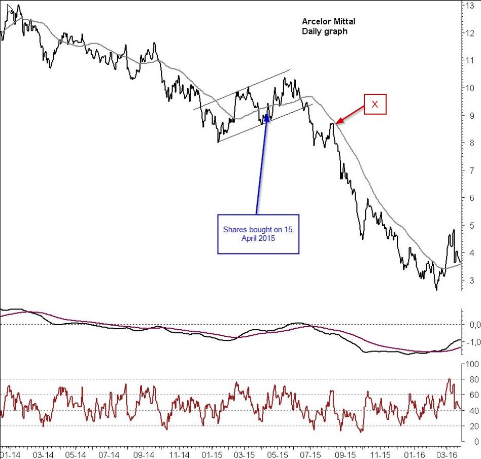
The trade was a buy of Arcelor Mittal shares in 2015. At first the trade was going fine, but then it turned sour and by looking at the competition screen I can see that it shows -59,9% today. Not so well. Look at the first chart and the arrow that shows you where he bought them.
OK, so how can we put a red cape on technical analysis? At first I thought this would be very easy. What usually happens is this: See the spot marked with a red “X” in the graph. This is usually where a fundamental analyst buys a stock. If that was the case it would be incredibly easy to put a red cape on technical analysis, because we can simply say: “Don’t buy stocks when they are below the moving average”. This saves probably 90% of the faults that fundamental analysts make. They calculate that the stock price is “too cheap” and then they buy (when prices are below the moving average). But when prices are in a downtrend we often see that a cheap price gets even cheaper. Of course it is an overreaction of the market, but that is how the market often is. I was hoping that this case would be an easy one like that, and then I would be able to say the old technical saying “Don’t catch a falling knife”. The stock price is below the moving average, so we simply stay out of the way until prices have fallen enough and the overreaction is done. A break above the moving average is what we are looking for. As you can see we have a break above the moving average here in Q1 2016 and this is a much better proposition now. Prices are way too cheap (in a fundamental sense) and we have a break above the moving average.
The above is the easy version, but that didn't happen. You can see that our guy did not buy the shares at “X” like most fundamental analysts. He bought them at the blue arrow, and that is a much better place. After he bought the shares they very quickly broke above the moving average. So basically we are home safe: The value was cheap in a fundamental sense, and we got a confirmation from the technical analysis by a break above the moving average. Everybody’s happy. This guy actually did quite well - except that he lost 59.9% in the end - but I would definitely not have blamed him when he bought the share. I might have joined him. So how can we save this situation?
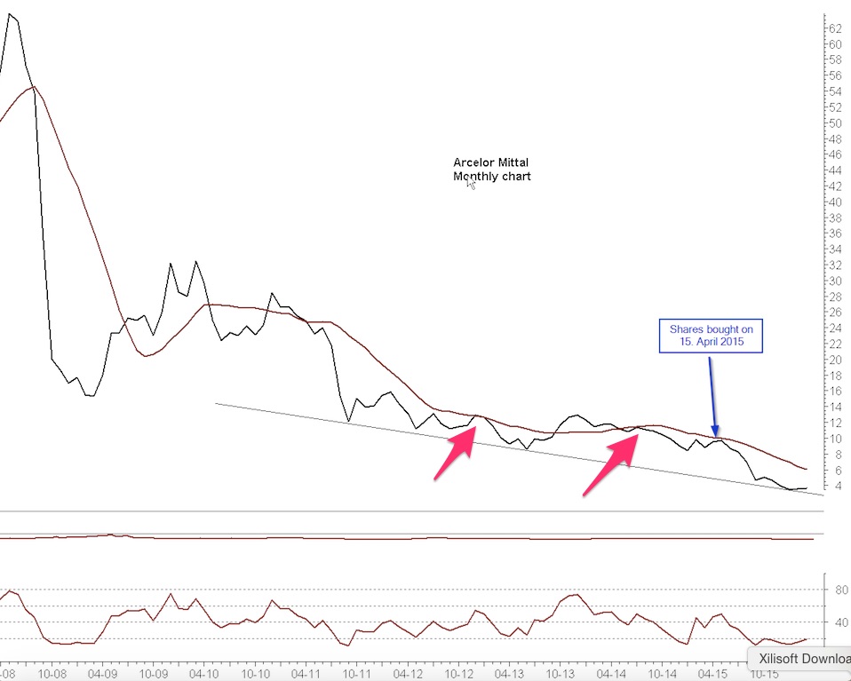
It turns out that we couldn't use the the easy solution. Ah, life is never that easy. But fortunately we just have to make one step up on the technical ladder to save the day and the truck. In graph no. 2 (“monthly chart”) we put the red cape on technical analysis. Using daily graphs, weekly graphs and monthly graphs is a very important tool in technical analysis, and I am writing a blog post on it that I hope will be finished soon. So I won’t go into many details here, just show the practical example.
Graph no. 2 (the monthly graph) shows where he bought the shares. The glaringly conclusion is, of course, that he bought the shares when they were below the long moving average. What a shift in perspective!! We know that a stock is not in a real uptrend until we have a break above the long moving average. I can already now hear the outrage of fundamental analysts, because they naturally don’t see the importance and beauty of a moving average. That’s totally fine. So let’s be pragmatic about this. If he had this monthly chart (but still disbelieving a bit in technical analysis) what would he be able to say?
1. We don’t have a break above the moving average. So basically the big long-term downtrend is still intact. He might not believe in the moving average, but it's clearly a warning sign. Real long-term buying is best done when prices are above it. At least that means that he has to be careful and not “hold on” too long.
2. From previous cases he can see that he might have a problem. The two red arrows show similar cases of prices increasing right up to the moving average, but “not being able to break above”. This is what I call a trampoline and it shows resistance (I write about that in other places). But even without these fancy words a fundamental analyst will be able to see that the market has reacted like this many times before (not being able to break above), so “I really have to be careful”.
The question is: When should he get out? There are two varieties: From a money management point of view he "always needs" to set a stop-loss, precisely to avoid big draw downs like this. So already with money management he would be saved. But what from a technical analysis point of view? When the stock shows an inability to break above the moving average that is a warning, and when the RSI falls below 40 that is a strong sell signal. OK, you want something more simple (I can read minds, and I clearly hear that you are tuning out when I start to talk about RSI, and that's understandable, so let’s keep it simple). The simple solution is found in graph no 1 (the daily graph). When prices break below the moving average again - that is where you sell. That happened one or two months after he bought them. The break below the moving average at that time confirmed the warning that the monthly chart was telling, and so he should have sold at that time. In that case he would have sold at 9.5 instead of letting the stock go below 3. What a difference!
To put it extremely short and simple: I would gladly have bought the shares along with the fundamental guy and be in the same boat as him. It looked really good (on the daily graph, that is). But the strong warning sign in the monthly graph would have shouted to me, in no uncertain terms, to put an extremely tight stop loss order in place. That is the only difference.
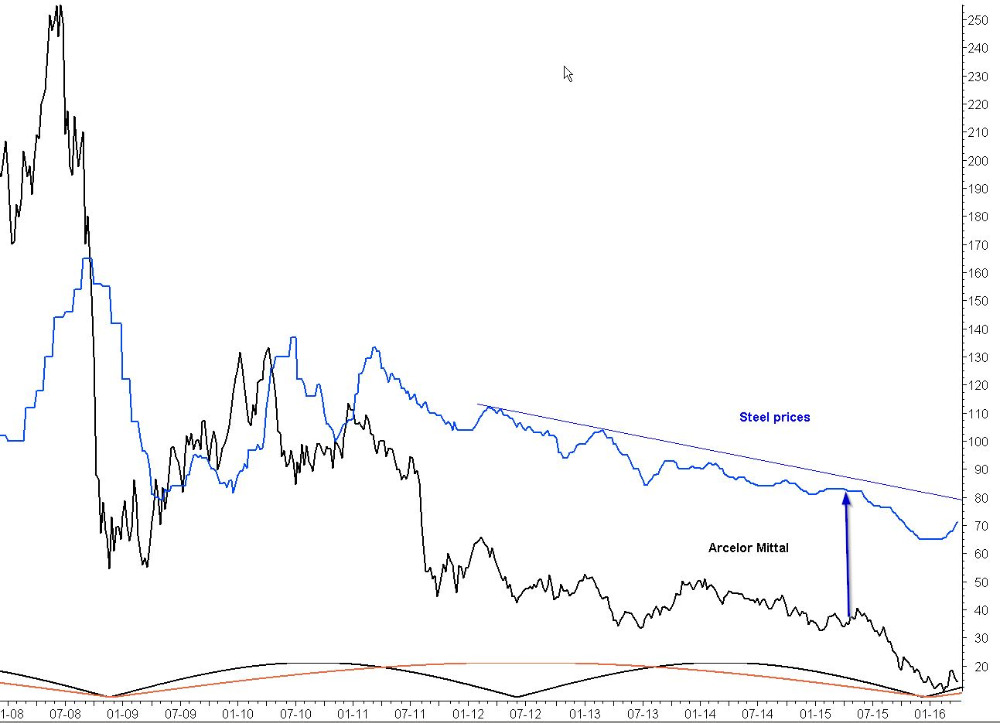
I have one last twist to this example. Look at graph no. 3 where I compare Arcelor Mittal with steel prices (the blue line). This is a fundamental view on the stock price. Naturally the stock price of Arcelor Mittal is very much dependent on the trend of the steel price (and the correlation seems to be acceptable in this case). What information do we get from this? Well, it basically shouts the same warning as the monthly technical graph. Steel prices are in a long term downtrend and there is no real recovery at the time that the Arcelor Mittal stocks were bought. What I like is that the fundamentals give the same view as the monthly technical graph - just from a bit different perspective. But the point is - they agree! This is the premise I always come back to, time after time. I nearly always see that they agree. There’s a small percentage where they don’t agree (and here I write about how to find the winner if they disagree), but in disagreements we simply refrain from doing something drastic. We wait. In this particular case they agree in warning us and advising us to use a tight stop loss. That would have saved us - or rather, have saved 59.9%.
That’s the end of my example. This is where I put a red cape on technical analysis and make it into Superman that stops a truck from getting into an accident. I realize that I make this point by being a coward and showing another man's mistake instead of owning up to my own mistakes - of which there are far too many I must confess. But at least I get the point across that FA and TA has a lot to offer each other when they cooperate. My basic view is perhaps a very simple one, but I do believe it works: If you are TA guy, you simply need to keep track of at least a few basic fundamental data, and this will help you a lot. If you are FA guy, you simply need to keep track of at least a few basic technical things, and this will help you a lot. Simple, isn’t it?
...now lets put a cape on, shall we...